
One of the pivotal pillars holding up the concept of data analysis is the principle of data visualization. Numbers, text, and statistics can be confusing, and too many can be easily misunderstood. Visually presenting them allows visual creatures like humans to absorb the information more readily and draw needed results. In this post, we will discuss different methods of converting data to a visualized variant. Before we dive into that, let’s clear up exactly what makes data visualization so vital.
If your business’s website needs a user experience boost, data visualization is the most effective means of achieving it. While you can use trial and error to progress through your learning experience of data visualization, the far more effective way of implementing its use is by consulting experienced and reliable professionals at a user interface design agency. See examples of such agencies at ui-ux-agency.medium.com. These organizations are stacked with experts who can leverage their deep skill sets and talent for their craft to generate the exact type of data visualization needed to bolster your company site’s success.
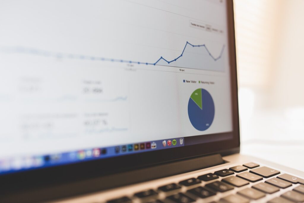
The Importance Of Data Visualization

A human brain is a potent tool that has been responsible for generating ideas and innovations we previously thought impossible. But the human mind has limitations, especially when it comes to visualizing massive amounts of information in a coherent, logical order. With the volume of data collected these days, businesses are rife with data. Still, it is applicable only when large batches of it can be presented in a manner easily understood by the human mind if it is to be utilized in any meaningful capacity.
As Big Data has expanded, more and more data is being collected, but it’s ultimately just raw data without organization and a visual presentation. Using AI and machine learning, this data can be used to figure out current trends and make accurate predictions. Data scientists rely on such visualization to be able to analyze, study, and convey data to others. But the use of data visualization spans across any realm, be it tech design, financial, marketing, or any others. If data is collected, it must be made useful for interpretation through an apparent ability to showcase it visually.
Purpose of Data Visualization
Looking through thousands of lines on a page or rows on a spreadsheet is not an effective method by which large volumes of information can be coherently interpreted. The idea is to have the data have meaning, value, and offer insight. While a data analyst may be able to draw weight to some degree in this way, it is undoubtedly not a valuable method of communicating the meaning of collected data to others. For a far easier method of data interpretation, a human mind needs to take in the data’s visual representation.
This is not a new concept either. Business schools have long taught students to present data through visualization to help the audience grasp what the data means and draw vital insights. For example, in a workplace, throwing numbers at management does not give them a good feel for what that means for the company financially, but plotting the data as points on a graph or presenting it in the form of a chart makes the data far more apparent.
How Data Visualization Is Used
While data visualization types vary and can be multi-purposeful, there are some prevalent and effective ways to use data visualization.
● Periodic Change Tracking: The most common and widely used data visualization method illustrates how the data collected changes over time.
● Frequency Identification: Typically working in tandem with the time-related changes are also data points that reflect variances in frequency.
● Correlation: Determining a relationship between two distinct variables is very challenging without being able to visualize it. Yet, it is a vital part of data analysis, one in which data visualizations’ involvement is paramount.
● Analyzing Risk/Value: With many complex metrics and variables involved, assessing the value or risk factor can be nearly impossible without the ability to visualize that data. Through charts or color-coding plot points via a formula, it is much easier to assess otherwise less apparent factors that could be game-changers in decisions made about a business.
● Study Of Networks: Marketers need to be able to break down their audience into segmented clusters, understand those clusters, assess the influencers in that sphere, and figure out how they relate to each other, as well as the outlier examples relevant to the particular area. Data visualization helps to classify this information into more evident, distinguished regions.
● Effective Scheduling: Complex projects entail the creation of often confusing schedules. This can be assisted by visual representations of the data, such as Gantt charts, helping to develop a more precise illustration of the projects, their stages, and the length required to complete them.
Data Visualization Chart Types

Now that we have covered the reasons for using data visualization, we can address the various types of data visualizations and how they are used. There are several helpful tools for rendering such representations, some automated, others manual. In either case, these are all great options for visually depicting data.
● Line charts: Line charts consist of two axes, typically dubbed the x-axis and the y-axis. It is used to depict changes relative to time. For instance, the x-axis can be broken down by months, while the y-axis by the number of sales made. The full chart represents the number of sales made over a year, broken down by month.
● Area graphs: Area graphs build onto line charts, typically depicting the area under the different colors. This is the relevant area for the viewer to observe.
● Bar graphs: Similarly to a line chart, a bar graph depicts changes over time, with the added advantage of leveraging more than one variable. In other words, using a bar graph can be helpful in comparative analysis of data over periods, such as a side-to-side comparison of units produced over several years, broken down by year.
● Histograms: While similar to a bar chart, histograms are used to measure frequency over time. This type of data visualization tool utilizes an x-axis (commonly depicting intervals of a particular variable) and a y-axis (used to represent a frequency inside the area of the specific variable of the x-axis). For instance, a histogram would help track the history of survey answers, broken down into ‘bins’ of available answers such as ‘good’, ‘average’, and ‘poor’. Each area represents how many people provide that particular response.
● Scatter plots: Scatter plots are used to establish correlations between two factors. The points are plotted in the mapped areas (when a is one thing, b is this thing), with some regions of plot points clustering together, showing a mainly established trend. However, if the facts are scattered all over the plot, it is an indicator that there is no notable trend in play.
Final Thought
Conducting data analysis, at its very core, is done to gain insights and pick up on valuable trends that will dictate the next few steps a business will take, making its effective visualization a crucial factor in the process. UI design agencies are well versed in compiling and depicting useful data via visual means throughout the entire journey of the data analysis cycle, all the way from preparation, through integration, and finally, consumption, offering businesses graphs, plots, and charts to more easily comprehend the massive amounts of collected information.


