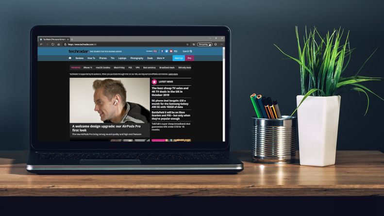
One of the most popular, visually receptive, and overall superior features, as backed by various studies, in modern web design is the implementation of a dark user interface. A dark UI can revitalize your website, improving the number of leads it solicits and boost conversion rates. If your website is already doing great in these respects, then you may not need a dark UI. After all, why fix what isn’t broken?
In this post, you will learn about the benefits of what dark UI is and how making use of it can help your website. If your company still does not have a website, but you feel it’s past due that you established a web presence, we recommend reaching out to a UX agency with a prepared list of ideas for its layout, format, and intended content. If you have a website and believe that using dark UI is something that would be beneficial, a web design agency can assist you in that regard as well. See examples of such agencies at bootcamp.uxdesign.cc.
What Is Dark UI?
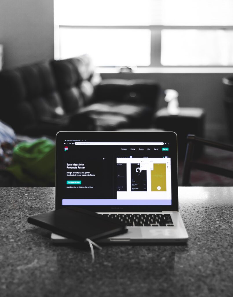
In essence, a dark UI is a setting or toggle-controlled feature which converts a standard screen display (dark text on a bright background), over to a dark screen display with lighter text, leveraging gray as the primary color of the surface.
Dark UI is more user-friendly as it emits less light and naturally promotes the visibility of lighter text against a much darker background. Often taken for granted is eye fatigue that comes from staring at a screen rife with brightness. Dark UI provides a solution by only emitting light from the text on the screen rather than from the entirety of the background.
Aside from the primary purpose of reducing eye strain, a dark UI also addresses the very common focus problem. Because the bright colors in the background draw the eyes’ attention with unused white spaces of certain web pages, a dark background redirects the focus to what is actually brighter on the screen: the website’s content.
Some believe that darker backgrounds are only more helpful for nighttime viewing in the absence of ambient light, but in reality, dark UI reduces eye discomfort regardless of the hour of the day by making images and text on the website easier to see.
Energy Savings
It takes significantly less power to display darker backgrounds than lighter ones. As an example, consider that the disparity between using a Google Pixel device on its brightest setting versus its darkest yields as much as 6 times less power being consumed.
The power savings do vary from one device to another. In fact, the screen type used by the device is actually a very significant factor in terms of its energy consumption with a light background against a dark UI. Because dark mode is optimized for OLED and AMOLED screens, LCD screens do not benefit nearly as much from its utilization. The iPhone XS, for instance, which is designed with an AMOLED screen, has been shown to yield as much as 63% in energy savings. For this reason, most smartphone producers are developing devices with OLED and AMOLED screen types, moving away from LCD screen usage.
PC monitors and laptops can also effectively utilize dark mode for viewing, helping visibility and reducing eye strain, as well as other health effects including headaches. As these screens emit significant blue light, dark UI helps the screens be easier to look at, but like most devices of this type have LCD screens, they don’t go very far in terms of energy savings unlike devices with OLED and AMOLED screens.
Color Perception With Dark UI

Most iOS and Android devices feature night filters, but those are not true dark UI modes, and deliver what is essentially an illusion of reduced eye strain and are notorious for discoloration effects and distortions. A dark background UI, serving the purposes of eye tension and staring reduction, energy-saving via muted color use, and limited image distortion is more keenly aware of aesthetics.
Tips For Using Dark UI Design
If you have settled on a dark UI motif for your website, allow us to offer a few helpful tips in that regard:
1. Let Users Choose The Mode
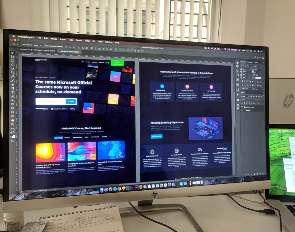
There will always be users who prefer one mode to the other. Pleasing everyone is impossible, and therefore should not be attempted. What users do appreciate, however, is the ability to make their own decisions about their mode of preference. Designers should not regard themselves as knowing what’s best for the user, and leave the decision about the preferred operation mode in the user’s hands. Some users will prefer a particular mode, while others may choose to toggle between the two.
2. Don’t Go Pure Black
While dark mode does entail the use of a dark background, it should not be pure black. Entirely black backgrounds are actually more irritating to viewers’ eyes than bright mode screens. Dark backgrounds protect people’s eyes from the strain of having to focus on exceptionally bright colors, a black background expands the strain by making things on the screen hard to focus on. For that reason, when using dark mode, it is advised that designers use light or dark grey backgrounds.
3. Color Desaturation
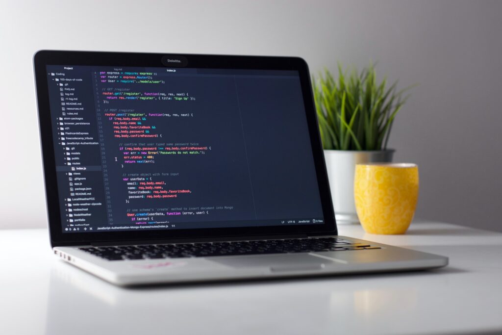
If there is one thing more frustrating than both a pure white or pure black background in web design, it’s the use of loud, bright, and very saturated color schemes. Profoundly bright colors make the task of distinguishing written text difficult. Designers should focus on using neutral colors that will not strain users’ eyes but will still retain a visual appeal. It goes without saying that this design choice could turn away potential clients, something that no designer ever wants to do.
4. Depth
The key essence of app design, especially in dark mode, is understanding visual depth, as well as the comprehension of a hierarchy between the design’s elements. For instance, in light mode, a shadow effect can yield the visual sense that a screen component is elevated over the background. With dark mode there are no shadow effects possible, so the common solution is to use colors to distinguish the objects on the screen from the dark background underneath. There is a direct relationship between the surface elevation and the degree to which the lighting becomes more pronounced.
Final Thought
Using a dark UI certainly has a lot of advantages, but the focus should always first be on the end-user as this is your audience and your site’s viewers. If you choose to go with the dark mode theme, you can always turn to a user experience company for assistance, but if your current site works, there is no reason to rock the boat.

