
Picture yourself lost in a strange building or parking lot without any signs to help you find your way. You would have no idea what to do.
This is why signs pointing in the right direction serve an essential purpose in our daily lives and can help your company foster an inviting and practical setting for its employees, customers, and visitors. However, not all signs indicating directions are the same, so it’s important to pay attention to the specifics. Clearly, the design quality of these signs varies widely.
Here are six tried-and-true ways to make directional signs that will make your building feel friendlier, whether you are putting them up for the first time or updating your old system.
1. Reduce the amount of text as much as possible
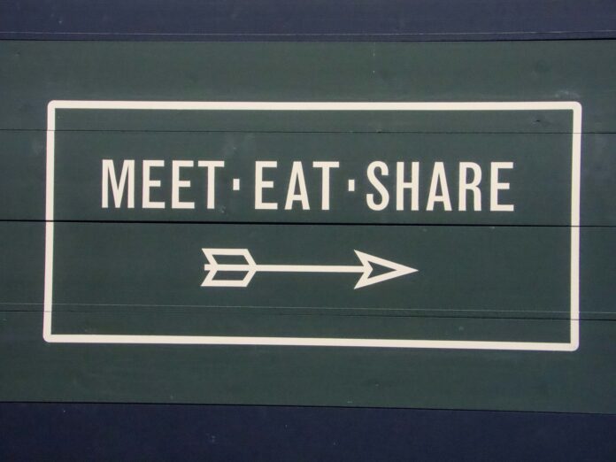
Minimizing the amount of text on signs is a crucial design principle for any type of directional signage from Rise Vision. The text should be cut down as much as possible, whether it’s telling people where to go, marking a room, giving them general information, or telling them about a rule.
Keeping your message to a minimum of words is always the best option. One word or perhaps simply a symbol may be adequate in certain circumstances, such as the bathroom area. Moreover, you need to reduce the amount of text on a navigation sign to ensure easy readability from a distance. People are more inclined to ignore a sign if it has too much writing on it.
In spite of the bustling environment, directional signs are useful for everyone, not just those who are actively seeking guidance. They’re also helpful for those who require something more than just words to tell them where to go or if they’ve reached their destination.
2. Simplify your design
Highly stylized images have no place on directional signs. Hence, when creating wayfinding signs, it’s important to make sure they’re visually appealing and simple to read so that people can quickly obtain the information they need. This involves not overloading the design with unnecessary details.
Too much going on in a design might make it difficult to read the text, whether it’s from too many different colors, too much decoration around the edge, a too intricate picture, or an overly rich background. Any or all of these elements can diminish the effectiveness of your directional signs. Because of this, most people will find them less aesthetically pleasing.
3. Signs should be placed where choices need to be made
A person should be able to follow the signs from A to B without any difficulty. This means that a visitor to your building who isn’t familiar with the layout shouldn’t get lost while trying to reach their destination.
Signage systems that aren’t very good at what they do lead people in the right direction but then leave it to their own disposal to find out the rest. Instead, make a path with your symbols that others can follow. Some establishments opt for floor graphics depicting a network of varying-colored lines that each point in a specific direction.
For instance, institutions like museums and hospitals often employ such navigational aids. Place signs at every turn in the route, whether they be in the parking lot or within the building if you’re not making a continuous path. Remember that whenever a visitor to your facility has a choice between two routes, that intersection is a decision point.
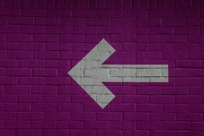
4. Play with arrows strategically
If you need to indicate direction on a sign, an arrow is the most appropriate option. The shape of an arrow is instantly recognizable in almost every culture. But you should use caution when using arrows in your directional signage.
Misleading or unclear arrows can lead to sloppy thinking. An arrow pointing upwards next to the phrase “cafeteria,” for instance, could mean that it is directly ahead of the reader or on the next floor up.
Some situations call for arrows that aren’t only up, down, left, or right but also diagonal or curved to point in the appropriate way. A flattened-out arrow pointing forward while up is a quick and easy way to indicate which direction is forward.
5. Take into account the context of the sign
More than just the symbol itself, context is crucial. A well-made guidance sign may be worthless if placed in the incorrect setting. Think about the placement of each sign as you create it.
When looking at the sign, one can wonder what its backdrop looks like. Putting the sign on a wall that already features a mural or vibrant wallpaper, for example, could cause it to get lost in the decor.
Your best bet for maximum visibility, if you must post the sign here, is to keep it simple and black and white. To make the sign stand out more, you could either reposition it or add a simple border to it.
6. Get people’s opinions on the direction signs you’ve made
Request opinions on the effectiveness of your new scheme of directional signs after you’ve put them up around campus or inside the facility. Feedback requests demonstrate your interest in making improvements for the public’s benefit.
If people are responding positively to your new signs, you can consider them a success. If you receive complaints, you can use them to make your signs better. If people are confused by a sign, you may need to either add more signs, move the sign, or redesign it.
ShieldCo’s Custom-Made Directional Signage
ShieldCo is widely recognized as one of the most well-known and respected custom metal fabricators providing custom-made directional signage. They are the greatest signs partner your business can have since they have access to a wide range of materials and the most advanced printing technologies.
Don’t settle with boring, generic signs if you want to guide and inform customers while also showcasing your company’s identity. Get professional directional signs made for your company with ShieldCo today. They’ll be more than happy to lend a hand in coming up with a winning design and determining the most appropriate resources for your building or facility.


